Tuesday, June 29, 2021

Hello!

Reverse Confetti's Stock Your Stash Hello/Just Because Challenge here made me want to enter again. I made a simple gift tag with the Toucan of Friendship stamp set, and the fancy eyelet comes from one of their tag die sets too!


I ink blended with Ranger distress oxide inks on a white panel, then stamped in black with Versafine Archival Instant Dry Pigment Ink. I spritzed the tag with water (although the spots barely show in the picture) and added sequins for sparkle! I adhered the panel to black cardstock, then ran an ink blending brush over the black and white twine with some Abandoned Coral distress ink to make it match the tag. (Kudos to my hair stylist who packages product that I buy in these cool beachy bags!)

Feeling tropical today? I have been for a few days with my papercrafting!

See you soon!

-Carol

Monday, June 28, 2021

Happy 4h of July!

Another red, white and blue card for the Simon Says Stamp Wednesday Challenge (Red, White and/or Blue) here! I love pulling out this bear and his accessories, and have not previously used the 4th of July images. So fun!


Edited after posting: I was cleaning my desk after making a few things and found the sunglasses that I REALLY wanted on this bear! UGH! Here he is with his cute and shiny sunglasses!


All stamps are from Ellen Hutson Bear Ware sets and dies. I used a variety of black, red, white, blue inks and Glossy Accents to make the barbeque shiny. Prismacolor pencils were what I used to color the grill, hot dog and the flag. I made a short bear by cutting the regular bear off at the waist and moving his torso down over the bottom half. I used the glitter vellum because it seemed like fireworks and the inked background is one I posted twice at the end of March. Fun technique!

Hope your 4th is great! Check out the challenge for lots of fun red, white and/or blue inspiration!

-Carol

Saturday, June 26, 2021

Happy Summertime

I am channeling my inner Pop Art/Andy Warhol today by using colors that aren't the usual ones for some of these objects. I wanted to stick to hues of red, white and blue as much as possible as well as give a postcard look to the scene. This week I am playing along with the Simon Says Stamp Wednesday Challenge: Red, White and/or Blue here as well as the My Favorite Things Wednesday Sketch Challenge #547 here.


All stamps are from The Greetery's Destination Summer stamp set and dies, and the postal die is from The Greetery as well. I popped up everything but the postal die cut on foam tape and added some blue sequins to mimic the sparkle of beach water. It's CAS in that it has a lot of white space, but it took some ink blending on the background pieces and two-step stamping on the trees, umbrellas and sailboat, which is actually fun for me.

Check out the cool cards the design teams made on these two challenges for inspiration. They are fantastic!

See you soon,

-Carol


Wednesday, June 23, 2021

Age is Just a Number

I'm so pleased to be a Featured Stamper on The Color Throwdown CTD648 here this week! The colors you need to use are shown below. I decided to use this cake stamp with its beautifully drawn flowers for this week's challenge.


I stamped, then colored the die cut cake and banner, then assembled the card front with my handmade "shiplap boards" that I had left over from a card I made several months ago. (See description below for the shiplap step) I popped up the cake and banner on foam tape and added Wink of Stella to the sides and top of the cake for shimmer. I don't think the camera caught the full effect of that shimmer like it is in person.

Products used:

Cake/Banner stamps and dies - Concord and 9th Happy Day

Colors: Shades of pink, orange, green and lavender Prima Watercolor pencils

Ink: Simon Says Stamp Intense Black 

Shiplap directions: 

On white cardstock that is about 1.5 times larger than your intended card front (so you have plenty of shiplap to make a card front with), ink blend 2-3 colors of ink (I used pale grey and a pale brown) all over the panel until there is no white left. I do splotches of each color here and there, no pattern at all. I dry it briefly with a heat gun. 

Run the ink blended cardstock through the Big Shot machine using a woodgrain embossing folder or cover plate for a wood texture.

Water down some white acrylic paint and brush it  horizontally on the panel, lightly, so that the ink blending will still show through. Then dry the panel with the heat gun. 

Last, water down some black (or dark brown works) acrylic paint and flick it over the panel to get some specks of color. 

After that dries, cut the panel into approximately 3/4" strips that are longer than you need to cover the width of the panel. (If they are longer you have more strips or partial strips to work with.)

To make a card front/panel: 

Use glue to adhere the strips to the front of your card because they are stiff and need a strong adhesive. 

Add 2-3 strips per horizontal row on the card front, with the strips butting up to each other at a different spot on each row. (Have 1-2 butting up points on each row that do not match the row before or after the row you are working on) 

With a paper trimmer or scissors, trim away any strips that extend beyond the card front width or length.

The card I made today only shows two butting up points because the cake covers the others. See them below the cake? 

Variation in the color of each strip makes the card front even more interesting. 

Hope this all made sense and that you try the shiplap technique. It is fun and not hard at all!

Check out The Color Throwdown challenge this week for all the great ideas using the colors this week!

-Carol


Tuesday, June 22, 2021

Come to the Beach

I am playing in two challenges today with my CAS beachy card. Waffle Flower June 2021 Challenge - Inspiration Week 2, #wfchallenge2106 here and Tic Tac Toe Challenge #118 here

For the theme of "use a rainbow without using a rainbow" in the Waffle Flower challenge, I actually used the rainbow colors in order, starting with the girl's red bathing suit, then her skirt, top, beach ball from left to right, including the round end piece of the ball. ROY G BIV: Red, Orange, Yellow, Green, Blue, Indigo, Violet: A subtle use of rainbow colors.

For the Tic Tac Toe challenge, I chose the top row: friendship, summer theme, single layer. My friend Nancy often says, "Come to the beach" because she lives several miles closer to it than I do and we like doing a girls' morning out to sit and chat...and by the way, our water is this color in the Gulf of Mexico!


Products used:

Waffle Flower - Sandy Toes stamp set (beach girl and sentiment)

The Greetery - Destination Summer stamp set (birds)

Sizzix Thinlits - Geo Floral Frame (made into a stencil)

Simon Says Stamp - Intense Black Ink

Stampin' Up! - Various Classic ink pads

Prismacolor - colored pencils

Ink blending brushes

Check out both challenges...I love seeing all the different ideas people come up with for the same challenge!

Sea you at the beach!

-Carol


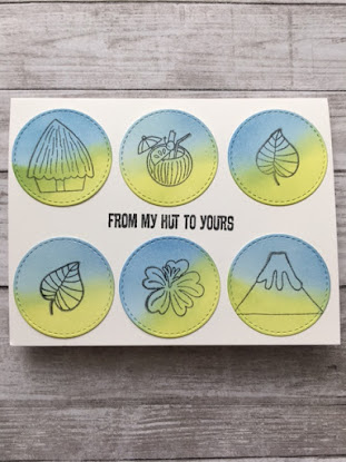
From My Hut To Yours

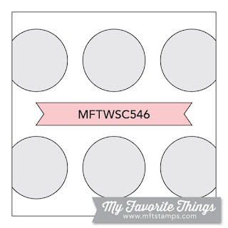
Here is my card for the My Favorite Things Sketch Challenge #546. Cute sketch!!!! There are the coolest cards over there!! Check them out here.


I used my MFT Tiki Party set and Inside and Out Stitched Circle dies along with distress inks! So simple! Makes me want to go to an island!

Sea you soon!

-Carol


Tuesday, June 15, 2021

Summer Vacation

It's that time of year for 4th of July weekend, family reunion vacations, and weekend getaways! And this year we are all able to leave home and get the change of scenery that we need. Here is my little summer holiday/vacation card. This card is for The Card Concept #157 where the theme is vacation time (I was inspired by their photo elements that represent vacation/leisure time activities) and AAA Cards #192 (here) where the theme is One Corner and an optional twist of Childhood Memories. 


The bike on my CAS card is like one I had as a young girl. Mine was pink and had the multi-colored streamers that blew in the wind as I rode around the neighborhood. Do you remember this type of bike with the banana seat? And bikes had fenders!!! I spent so much time on my bike as a child, and summer vacation from school gave me June, July and August to do so. I drew on some extra red streamers and the stars were added to represent fireworks.

Stamps: bike (unmounted, source unknown), stars (Stampin' Up!), sentiment (Flora and Fauna Flamingo Pool Party set).

Ink:  Stampin' Up! Classic ink pads

Wonky Stitched Frame die: Simon Says Stamp


I also made another card just for fun with the decorations/noisemakers in the spokes of the wheels. Anyone remember doing that? With clothespins and playing cards? LOL!


Hope you have a great summer and/or vacation this year!

-Carol


Saturday, June 12, 2021

Sea Glass Hues

Sea glass is so pretty, especially if shades of blue and green are among your favorite colors. I didn't realize until I took pictures of this card that the hexagons actually look like sea glass, but I'm glad they do! I am playing along with AAA Cards CAS Game #191 (here). 


I made a stencil out of a hexagon die and masked it off for each color for ink blending. Then I stamped the scenes in black ink.

Hi Shaker Hexagon die: Pretty Pink Posh
Stamp Block: Embossing Arts Company
Sentiment: Hero Arts Color Layering Waves set
Ink: Simon Says Stamp Intense Black, and Stampin' Up! Pool Party, Coastal Cabana, Bermuda Bay, Tempting Turquoise and Brilliant Blue

Go take a look at all the ideas people have going on over there!

Sea you soon!

-Carol


Thursday, June 10, 2021

Beachy Vibes

Recent purchases sitting on my desk were begging to be used and when I saw this week's Color Throwdown CTD646 prompt using light grey, aqua and navy, it was all I needed to make a beachy card!


I have been seeing sunglasses cards with scenes in them the last couple of days and was hoping to play with the idea. Right before bed last night I opened the tropical drawer of my stamp storage and saw these palm trees. I cut out the lenses and stamped the palm trees on them and they fit! First thing this morning I had to get back to making this card!

Products:

Sunglass dies: Bright Eyes from Concord and 9th
Tag: Reverse Confetti
Stamps: Sea Breeze from Honey Bee Stamps, Palm Trees by Graphic Rubber Stamp
Ink: Simon Says Stamp Intense Black, Ranger Distress Oxides in Broken China and Chipped Sapphire

Now that I have used the glasses once, I really want to keep making things with them!!!

See you soon,

-Carol

Tuesday, June 8, 2021

The Ocean Has My Heart

June is here and a sure sign of summer is people going to the beach and boating. My mini slimline card is my entry into the Addicted to CAS #199 challenge: Beach (here) and Always Fun Challenges #217: Layers (here).


I recently bought some dies from Poppy Stamps and was dying to use the sailboat. Once it was cut, I decided it needed to look like the wind was in its sails, so I bent the sails and also the waves under the boat. I added a little foam tape under the sails as well to lift them off the card. I feel like the bottom waves look like I used crumpled cardstock, but the bends in the paper are intentional. I used a sentiment from Birch Press Design's No One Like You set and The Greetery's Destination Summer birds stamp and the card was complete.

There's nothing better than sitting on the beach and watching the boats go by! Happy summer!

-Carol


Relax

Here is a companion card to the Cheerful Hello card I posted a couple of days ago. Today I created the same type of background using Channin Pelletier's ink swiping technique again (linked in that post). This card is for a teacher friend who deserves a little celebration of summer in the mail after a hard school year. This is my second card for The Paper Players Challenge #544 this week (here): Signs of Summer.


My "Relax" card uses the Poppy Stamps Flamingo die and a leaf from Altenew's Hibiscus Garden 3D Dies.  I ink blended them both a little with Distress Oxide inks. The sentiment is stamped in Simon Says Stamp Intense Black Ink using Stampin' Up's Beach Happy set and the Reverse Confetti tag die is cut from shimmery irridescent vellum. The thin strip on the right side is what I cut off to make the panel narrower, and I decided to turn it upside down and attach it to the panel. I might just make a set of these to have on hand as a gift!

Enjoy your summer!

-Carol

Monday, June 7, 2021

Signs of Summer

I saw and had to CASE this idea from Facebook where Stampin' Up! demonstrator Christine Versluis said she was inspired by the SU latest catalog sample of this quilting Cathedral Window design. I am playing along with The Paper Players PP544 this week where the theme is Signs of Summer.


Quilted Cathedral Window Pillow from Pinterest


All I had to do was punch out 10 circles (2 1/2" Marvy circle punch) and make a 1 3/4" cardstock square. I centered the square on top of each circle and folded the round edges toward the center of each circle along the edge of the square. I used a variety of  patterned papers that I had on hand and grabbed random stamps to make things to go inside each window. I adhered my items inside each window, then lined them up to avoid the same patterned paper or contents to be beside itself. Next I glued the folded up edges to the ones that butted up to each other. Then I was able to cut a cardstock white background and glue the joined windows to it. I matted the panel to an aqua mat and then a red one. It measures about 11" x 6" and is going to either be put in a shadow box to display in my craft room or  stand on a clear picture stand in the same room.

The sentiment is from an ancient Paper Smooches set called Fruitastic and the strawberries are from an old Stampin' Up! set called Tart and Tangy. I think the butterfly stamp is from Magenta. 

I used a Wink of Stella pen to add shine to the side of the strawberries and Glossy accents for some of the flower centers. Rhinestones added some sparkle and I used some taupe/silver baker's twine behind them like a vine.

This Paper Player's Challenge just started, so there is a lot of time to make something summery and join the fun. Even though I am retired from teaching, I still feel like it is exciting that summer is here, even in HOT Florida! Is the summer weather already happening where you live? 

I made my first strawberry pie in years last week and we are wanting another one. Here is my recipe that my mom gave me when I was first on my own. You can tell by how ragged the recipe is how much I have used it! The crust is like shortbread and the high altitude tip is from when we lived in Colorado. (BTW: Remove filling from heat as soon as it thickens, then add Jello and stir well.) For me, strawberry pie is a sign of summer if there ever was one!


See you soon,

-Carol

Friday, June 4, 2021

A Cheerful Hello

It's a rainy day here in Florida, but it gives me time to sit and make cards!! This month's Reverse Confetti Stock Your Stash Challenge(here) is Hello/Just Because. Here is my first card for this challenge.


I tried Channin Pelletier's ink swiping technique (here) for the background panel using Distress Oxide inks. Next, I die cut a Reverse Confetti tag from white cardstock. Then I stamped the pineapple from the Reverse Confetti Pineapples A Plenty stamp set using the rock 'n roll technique and two colors of Stampin' Up! yellow ink. I stamped a flower from the Reverse Confetti A Toucan of Friendship set using Simon Says Stamp Intense Black Ink and colored it with Copic markers. I grabbed my Wink of Stella pen to add shimmer to the pineapple and the leaves on top. After I fussy cut all the pieces and attached them with foam tape to the tag, I glued it onto the background panel.  I stamped the greeting from the Toucan set and made a flag out of it with scissors. I put the completed panel on a 4 1/2" and 4 1/4" side fold white card base. If you look closely you can see the sparkle on the pineapple that adds pretty shimmer to the card, along with the sequins.

This challenge is going on all month, so there is plenty of time to play along!

See you soon,

-Carol


Inspired by an Artist

The current Monday Challenge over at Simon Says Stamp is "Inspired by an Artist" (here) and I wanted to at least make an attempt. I like modern artists and I found Francisco Cerón with his bright colors and geometric pieces. He is a Colombian visual artist and his art combines Pop-art, Cubism and modern and classic techniques. If you notice my cards on social media, I love vibrant colors and that is his style. Here is a link to his website.

I have had a JudiKins stamp by Paula Best for YEARS that I have used in a variety of ways. Here is my Cerón inspiration and his original art:


Francisco Cerón, Blue Gold

I stamped my image in Simon Says Stamp Intense Black Ink, then colored it with Prima watercolor pencils. I wanted to make a little bit of a geometric background, so I added the colored rectangles outside of the image. The speckles are from a Stampin' Up! backgrounds stamps set. I mounted my panel with foam tape onto a black side fold A2 card. I couldn't believe how much this JudiKins stamp looked like his art! 

Check out the challenge for all the amazing artwork this week!

-Carol

Tuesday, June 1, 2021

Birthday Gift Card

An element of surprise is always nice, so here is a mini slimline card that ends up giving a not-so-expected gift to a birthday girl or boy!


The current Slimline Challenge at My Favorite Things is Gift Card Greetings (here). This card starts out looking like another coffee themed card...but inside it reveals a relaxing gift of massage. Maybe the recipient thinks that since it is his/her birthday soon that a Starbuck's card is tucked inside. Guess again! Surprise! 

I am also entering this card in The Color Hues Color Challenge TCH #19 (here): Blue and Brown. The finished card measures 6 1/4" by 3 1/4" and I make my own envelopes for this size card with my envelope punch board.

I got out my Catherine Pooler Mug Shots stamp set and inked it up with Stampin' Up! Classic Chocolate Chip ink. Then I colored the images with my Prima watercolor pencils. I added Glossy Accents to the hearts to go with the "shine" sentiment, and they ended up looking like chocolate to me!

Inside the card I used a punch that makes the slots for a gift card on a piece of white cardstock and stamped the two greetings from the Stampin' Up! Picture Perfect Birthday stamp set. 

(I practiced coloring with  pencils on a mock-up of my card first, then started over on the white cardstock panel...needless to say, I think it took all day to color the images! But I listened to Pandora and relaxed!)

Check out these challenges to see what the design teams and other participants are making!

-Carol