Friday, March 31, 2023

Eggstra Special Easter Wishes

My friends came over to stamp recently and we made an Easter card with these adorable bunny ears and some darling stencils. I cut a few extra sets of bunny ears because I wanted to try to use them again. A few days later I thought the ears would fit the giraffe dies and they do! I decided to share my clean and layered card over at The Card Concept 192 where I was inspired by the bunny taking center stage on the mantel with pops of white (and tan) amongst the other neutral colors/patterned background, like my card. Happy Easter Everybunny!


Products I used: 

My Favorite Things: Joyful Giraffe Die-namics

Waffle Flower: Bunny Ears die set

Sugar Pea Designs: Stitched rectangle die

Stampin Up!: Sentiment

Patterned cardstock

This giraffe die set is fun to put together. When you die cut the head and neck it leaves embossed marks so you know where to put the spots. So easy to piece together! I hope MFT makes comes out with more animals like this one! 

Wishing you a blessed Easter 2023.

-Carol


Saturday, March 25, 2023

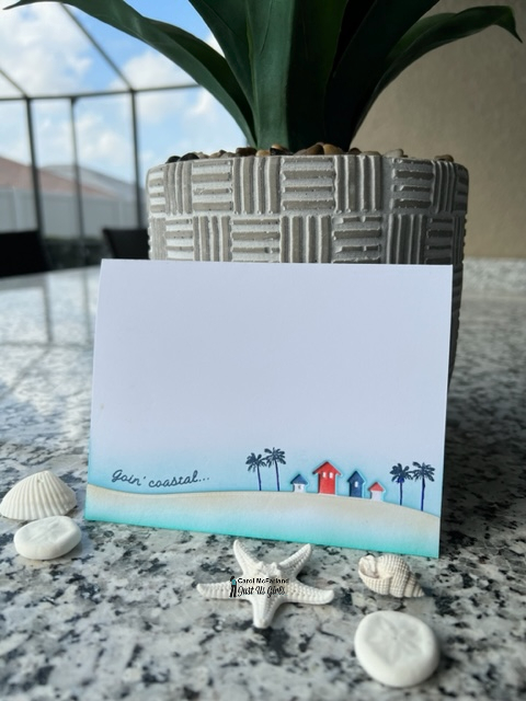
Goin' Coastal

This might sound familiar to you if you are a cardmaker. I bought this row of houses die eons ago and am just using it now for the first time. I felt like it was supposed to be for a winter snowy scene, but I pictured being able to make a row of beach huts. You know that for spring break people are "goin' coastal" to escape winter weather where they live! I made this card for this week's Just Us Girls #672 CAS theme: 1/3 or less. You've got to see all the different ideas the team and our talented guest Michele Ferguson came up with for you! I am also playing along over at Addicted to CAS: Spring and Happy Little Stampers Anything Goes with Dies.


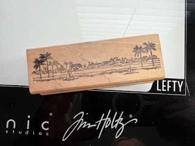
Below is my "vintage" wooden stamp from a store called Stampa Barbara in Santa Barbara, California...a gorgeous coastal city north of Los Angeles and the destination of many road trips taken long ago for stamp shopping. Seeing this stamp in my stash brings back good memories with friends!


Products I used: 

Memory Box: House in the Country die

Stampa Barbara: Seashore scene (palm trees)

Ellen Hutson: Everything's Beachy stamp set (sentiment)

Concord and 9th: mini ink cubes

Ink blending brushes

The first thing I did was die cut the scene from the bottom of the front side of an A2 card base. Using post it notes, I masked off each house to ink blend them in red, white and blue. Then I masked off the houses to be able to ink blend some sand and water beneath them. I adhered the scene to the bottom inside edge of the card back. With the card open and lying flat on my work surface, I ink blended the sky and stamped my trees and sentiment. I left a little white space between my sand and water to look like the white foam that hits the sand. (As you can see in the photo of my stamp above, the trees were part of a scene, so I just inked up the top of the trees by dabbing my ink cube corner carefully so that I would only get palm leaves. Then I penned in the trunks.) I stamped my sentiment and the card was complete!

We hope you will join us on this CAS week challenge, using 1/3 or less of your card and following our definition of Clean and Simple. Can't wait to see you in the gallery!

-Carol

Tuesday, March 21, 2023

Spring Cleaning with Paint

The As You See It Challenge #294: Spring Cleaning theme caught my eye because putting a fresh coat of paint on the walls of a room and organizing all of the contents in said room are the perfect refresh to do at this time of year. The challenge is to spring clean the stash and these paint chips have been staring at me for a long time. I got them to use with this paintbrush die set and I am happy to use both together today!


Products I used: 

Spellbinders: Artful Tulip die set

Stampin' Up!: Work of Art stamp set, Coastal Cabana ink pad, sequins

Silver cardstock

Versafine Onyx Black ink pad

Sequins

I made a 5" x 7" card base so the whole paintbrush would fit with a stroke of paint above it. I cut the paint chip in half and staggered the two pieces to go with the direction of the paintbrush mid stroke. I hoard some of my sequins too and these are some that I have had forever in my stash.

Speaking of spring cleaning, I need to get out of the stamp room and get to work on drawers and closets to be cleaned out! Do you do this every March/April?

-Carol


Saturday, March 18, 2023

You are the Zest

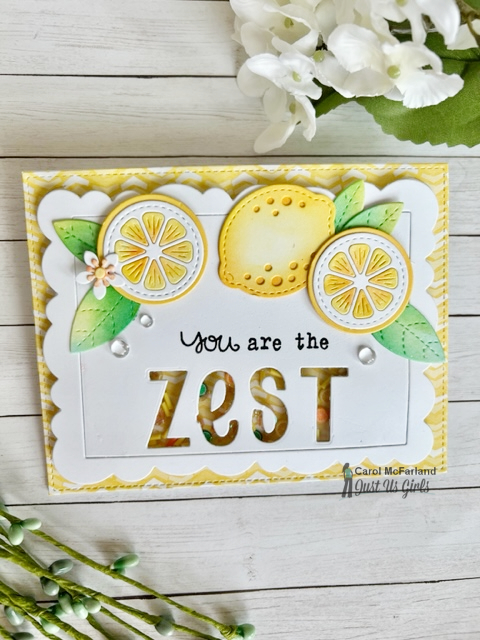
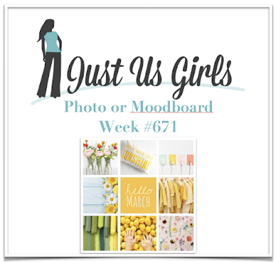
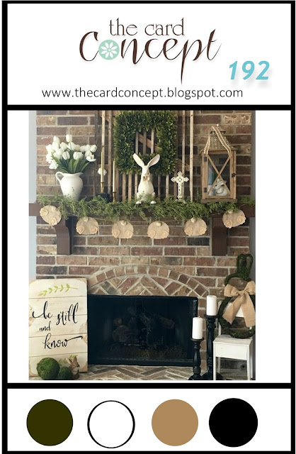
Lemon dies have been calling my name for a long time and I finally bought some...but I also fell in love with these alphabet dies and recently saw cards online using both sets together. I basically CASEd this card here and added a shaker "twist" filled with little lemons, limes and oranges. Our Just Us Girls Photo/Moodboard Challenge #671 this week has all sorts of yummy colors for spring that inspired my card. 

I'm also playing along at The Card Concept 191a because...lemons! Who can resist their colors and scent! Spring and summer are on their way which means lemonade, lemon sorbet in the lemon itself (see below), and Arnold Palmers (iced tea and lemonade)!! Suffice it to say, I was taken by the Card Concept photo with the lemons.


Products I used: 

Lawn Fawn: Zesty Lemons die set, Henry's ABCs die set

Avery Elle: Scalloped frame die set

Sugar Pea Designs: Stitched rectangle die

Paper Smooches/Stampin' Up!: Stamped together into one sentiment

Pretty Pink Posh: Clay fruit shaker elements

Concord and 9th: mini ink cubes, Dew Drop assortment

Ink blending brushes

Versafine Black Onyx ink pad

Stampin' Up!: Patterned paper

Acetate

Foam tape


I like a clean and layered card style. First I die cut my lemons, leaves and flower out of white cardstock. I ink blended all of them and adhered the pieces and parts together. Next, I die cut the scalloped frame, played around with the arrangement/spacing of the inked die cuts, then decided on placement of the "zest" dies. After die cutting my word, I removed the letters and created the shaker, holding my breath as I always do (because I usually make a mistake and have to start over). I die cut the yellow patterned paper so it would have stitching around the edges, then attached it to my A2 card base. Then I mounted the shaker on top of the card front. I added the lemons and leaves, stamped my sentiments and added the dew drops. 

As I mentioned above, I have a lemon sorbet recipe (not this one, but this sounds amazing too) that my daughter just loves, so I surprise her when she visits us! You make and freeze it in the lemons you used to make it! (If you need details on how to prepare the lemon "boats" for the sorbet, leave a comment below.) I couldn't take a photo of the cookbook page with my recipe I use because it is so worn with use and lemon spills...I guess that is a good sign! 

We hope you will find the colors and objects fun in our moodboard this week and that you will want to make a card using something you see in the photo. I think you will really like all of the team's ideas too, so be sure to visit their blogs for all the details on their cards!

-Carol

Friday, March 17, 2023

Let's Chill Soon

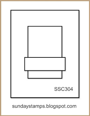
With spring break happening now here in Florida it is time for me to get out my beachy products and start creating. The Global Design Project #385 and Sunday Stamps Challenge SSC304 both fit with colors and sketch for this vacation card. Check out the challenge details below.


Products I used:

Simon Says Stamp: Chair die, sentiment

My Favorite Things: Cover plate

Variety of inks

Ink blending brushes

Patterned paper


I made a 5 x 7 card so that the swirly cover plate would fit with the card base border behind it. I actually used the exact colors of the GDP challenge! The chairs are ink blended on the edges and are popped up for depth. The shell patterned paper is glimmery!!!  That's about it! Makes me want to go to the beach right now!

See you soon,

-Carol


Saturday, March 11, 2023

Thinking of You

It's time for a new Word Week at Just Us Girls #670: Rainbow! There are all sorts of ways to do a rainbow (traditional, bold, pastel, stamped, die cut, etc.) and mine is a "loosely interpreted" rainbow, meaning it is not an exact ROYGBIV. I chose colors that I really like and went with it and I could have been fussing with the color order as we speak, but decided to leave it be and take a picture!


Products I used:

Simon Says Stamp: Etched Laurel Leaves dies

Concord and 9th: Thinking of You sentiment

Versafine Onyx Black ink

Vellum

5" x 5" white card base

Various carsdstock colors and brands

Random sequins

Glue dots


I traced around a circle die with a pencil on my vellum square in order to have a shape to follow when arranging my leaves. I adhered them to the vellum square with glue dots so I could pull them off if need be to rearrange. I also adhered the vellum to the card base with glue dots, under the leaves only, so they wouldn't show though. Last, I stamped my sentiment and added sequins. The sequins match the leaves near them in depending on the lighting, so if you move the card, they change colors. You can see the differences in the two photos.

Please join us with your rainbow ideas!

-Carol

Wednesday, March 8, 2023

Peace on Earth

At Christmas Craft Creations we are making one-layered cards this month! I grabbed some old Stampin' Up! stencils, one of their stamp sets, some distress inks and some irridescent rhinestones to make my card. These would be easy to mass produce or to create a boxed set.


We hope you will join us for this simple style of card this month. The team has made a variety of nice cards for your inspiration!

-Carol

Monday, March 6, 2023

Long Time No Sea

It is that time of year when spring break (and soon thereafter summer) will soon be here. It is quite warm already where I live so I am in the mood to get out my beachy stamps. I happened to see that the AAA Cards Challenge #235 is Ink Blending Along an Edge, so I thought I would create a bird's eye view beach scene. Many of the beaches here in Florida are famous for having sugary white sand, so that is what kind of beach my CAS card has to be!


Products I used:

Ellen Hutson: umbrella, sentiment

Sugar Pea Designs: wave stencil

Stampin' Up!: ink pads

Concord and 9th: ink pads

Versafine: Onyx black ink pad

First I ink blended a turquoise ink on the left edge of my A2 card. Next, I blended in some aqua/teal ink. I put down my stencil and added more of those two inks for the waves to appear. I stamped the umbrella (three layers to get the different colors and the stripes) and fussy cut it out. Last, I stamped the sentiment at the edge of the waves.

Now I need to hop in the car and go sit at the beach because that is all I can think about now!

Sea you soon,

-Carol


Saturday, March 4, 2023

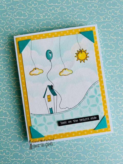
Look on the Bright Side

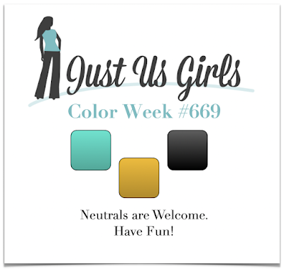
It's Color Week at Just Us Girls Challenge #669 and my sweet teammate Ina chose Turquoise, Mustard and Black. I ran across this printed design in my stash by Becky Oehlers from 2010 that I have never used. All I had to do was color and make a card with it. For some reason I thought of the old photo corners we used to use to hold photos in our albums and decided to add them here for more color on my card. What I like about this print is that it reminds me of the creative process of  starting a new card and how I picture in my mind the elements I might include. Nevertheless, I thought it was cute when I saw it on Becky's blog all those years ago.


Products I used:

Hero Arts: stencil (ground)

My Favorite Things: Mini Cloud stencil (sky)

Distress Ink

Ink Blending brushes

Tim Holtz Idea-logy stickers (sentiment)

Stampin' Up!: Patterned paper, markers

Post it Notes: to make masks for stenciling/ink blending


Here is the first card I made with another copy of the same print...not for this challenge.


I could just be dating myself with the photo corners and am now questioning my use of them on these two cards. This second card could be the first page of a photo album with its sentiment. What do you think?

We hope to see you in our gallery this week! Check out the team's cards to see all the details on their creative takes with this color combination!

-Carol

Wednesday, March 1, 2023

Miss You

I flipped out over this new My Favorite Things Creature Comforts die set when I first saw it and I needed to hurry up and use it once it got here so...here is its maiden voyage for two current challenges. The Paper Players PP629 challenge is a sketch that I really like, a square card, and The Color Throwdown #732 is using coral, yellow, blue and navy this week.


Products I used: 

My Favorite Things: Creature Comforts die set, Mini Messages and More stamp set

The Greetery: Cozy Cup Coaster Die

Archival Ink

Silver cardstock

Vellum

Ink blending brushes

Distress inks

I die cut all the elements out of white cardstock, then ink blended each one. I pieced them together, then arranged them on the coaster die. I wanted vellum for the tea bag to look real...I love it! I made the glasses look ombré, just like a pair I own. I always use silver cardstock for a spoon too because it looks so real! I tried to be CAS on my 5" x 5" card, but keep with the sketch. Can't wait to play with this set again with its cell phone!!!

Hope it made you smile!

-Carol