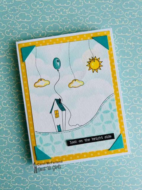
It's Color Week at Just Us Girls Challenge #669 and my sweet teammate Ina chose Turquoise, Mustard and Black. I ran across this printed design in my stash by Becky Oehlers from 2010 that I have never used. All I had to do was color and make a card with it. For some reason I thought of the old photo corners we used to use to hold photos in our albums and decided to add them here for more color on my card. What I like about this print is that it reminds me of the creative process of starting a new card and how I picture in my mind the elements I might include. Nevertheless, I thought it was cute when I saw it on Becky's blog all those years ago.
I could just be dating myself with the photo corners and am now questioning my use of them on these two cards. This second card could be the first page of a photo album with its sentiment. What do you think?
We hope to see you in our gallery this week! Check out the team's cards to see all the details on their creative takes with this color combination!
-Carol


.jpg)
13 comments:
Cute whimsical card
I think I'm in YOUR corner with the use of those photo corners, Carol! Especially perfect for these darling prints - thanks for the introduction to them btw. These sentiments are spot on and tell the story so well!
A really darling use of Ina's colors!
=]
Carol... love the photo corners! It is always good to revisit something we loved in the past. Make the old new again! The design is fabulous... if it were a set, I would definitely be putting it in the wish list. Fabulous cards!!!
Thanks for your kind comments ladies. (I wish blogger would let me reply individually) As Vicki said, it is whimsical and from 2010 when we were in a different place in stamping, but it was fun to color in two different ways and design a card around them both.
I could look at these for a very long time. Such a creative take on the colors and I love them both equally. I really like the stenciling on the first card a lot. These belong in a children's book, Carol. Well done!
I love everything about these images - the whimsical house, the rolling hill, the balloon and sun. So sweet! And the photo corners are certainly a wonderful touch! I'm going to keep those in mind; they're a great way to add both colour and impact.
hugs~carol
These are darling, I love the whimsical feeling they have! In fact, they remind me of the movie up!
Love your photo corners too Carol. They really add so much to both cards. What a fabulous fun layout with so much eye candy on both. Really like the clouds on the first card - so soft and fluffy like. Don't you love how good those stickers are of Tim's - so handy.
I love the whimsical nature of these pictures, Carol. They work great with the photo corners and the sentiment on the second is perfect for a journal or scrapbook.
Thanks ladies!
Super cute! I love the little scene with those clouds and sun dangling. Great use of this week's colors!
That image is so cute and I love the way you colored it (both times!). Very cute card!
Thank you ladies!
Post a Comment